Welcome to Bren On The Road 3.0!
You might notice things look a little different around here. This is the second redesign I’ve done since launch, and the first in 4 years. It’s a big change from how things started!
When I first started this site in 2013 I knew nothing about websites. I knew nothing about how they worked or how to build them.
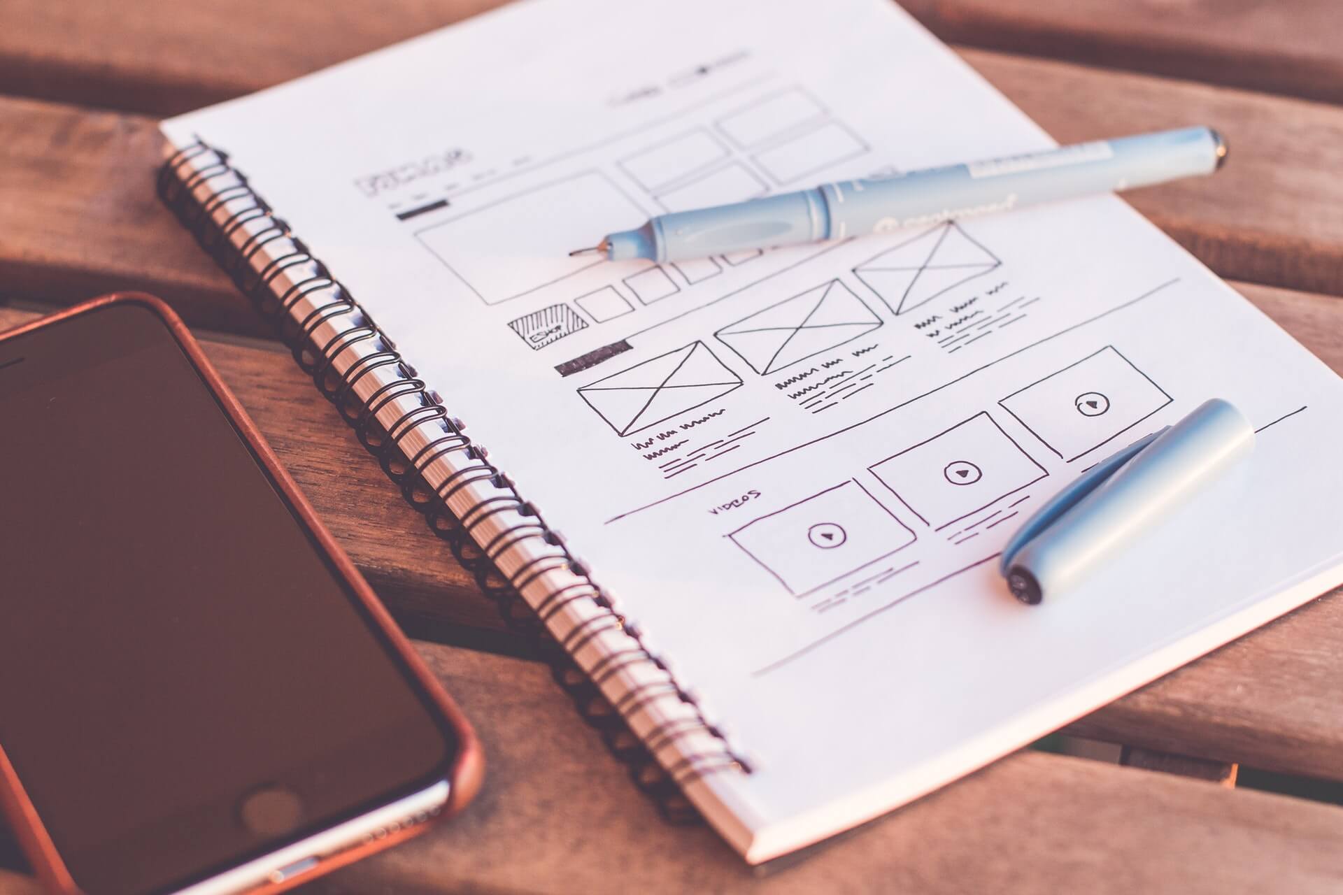
All I knew is I wanted a blog, and in my mind I knew exactly what I wanted it to look like. So I drew some sketches, took photos of it on my phone and then paid a designer in India $150 on Upwork to make my blogging dream come true.
Over a month of back and forth over email we built this little blog and I thought it was the coolest thing in the whole world. But I still didn’t really know how it worked or how to use it.
Then like a miracle a few of my first blog posts went viral like my Singapore Airport post and my Philippines food post and within a couple of months my blog was everywhere and my server was crashing every day under traffic most bloggers only dream of. The learning curve for blogging is already steep but suddenly mine was vertical and I found myself sprinting at full speed trying to learn blogger life as quickly as possible!
A couple years of blogging experience I finally did my first redesign. I used the same designer, but this time I had a much better idea of what a blog was supposed to do and what made them good and bad. Instead of just scribbling designs on paper I created a meticulous graphic in Canva of what I wanted right down to every single px on the margins and every single font size and border. I paid a few hundred dollars more than the previous time and we created a beautiful design that I still really love.
But it’s been four years since we did that, and the internet has changed a lot since then. The site has been getting slower, and more clunky as I keep adding random things on and taking things off. Plus I’m not sure how clean my designer’s code was under the hood, but I noticed a lot of things poking out of place over the years.
One thing that also spurred this redesign is Google has made site speed an important factor in their search results, and my site is much slower than the competition these days. All those broken pieces floating around make the site a bit like an old car.
I also felt it was time to evolve this site again into something fresh. My life has changed a lot since 2016, and just like life, I feel like the blog should be ever-changing too.
About a week ago, I finally set out to create Bren On The Road 3.0. The difference this time was I didn’t have a designer – I purchased a few design tools and rebuilt the site on my own from scratch. This meant I had to invest many more hours but also meant I had complete control over the entire build; something I’ve never had before. That’s not really a good thing for a perfectionist and it’s been a long week, but I’ve loved the whole process, and will be excited to do it again in a few years.
Let me give you a tour and show you what’s changed.
Blog homepage
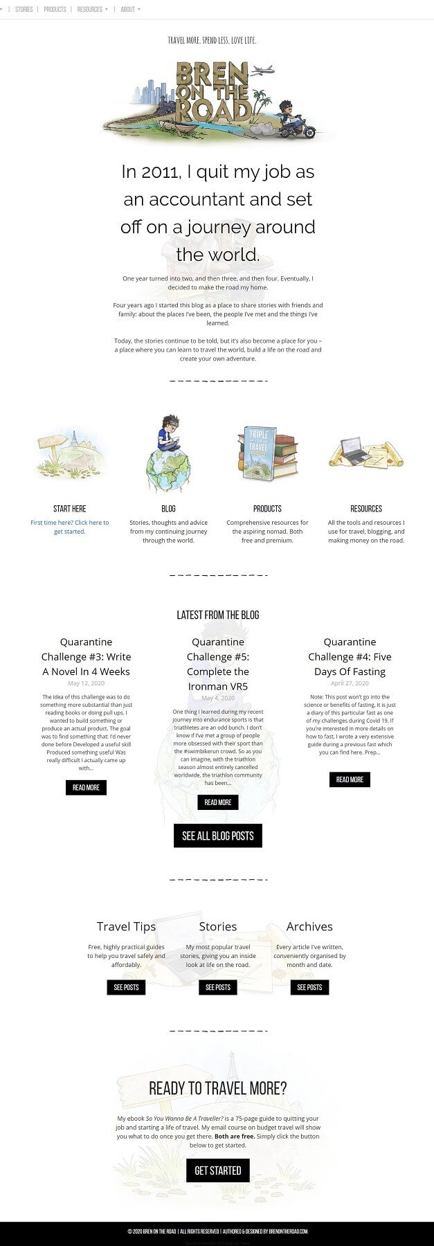
Before
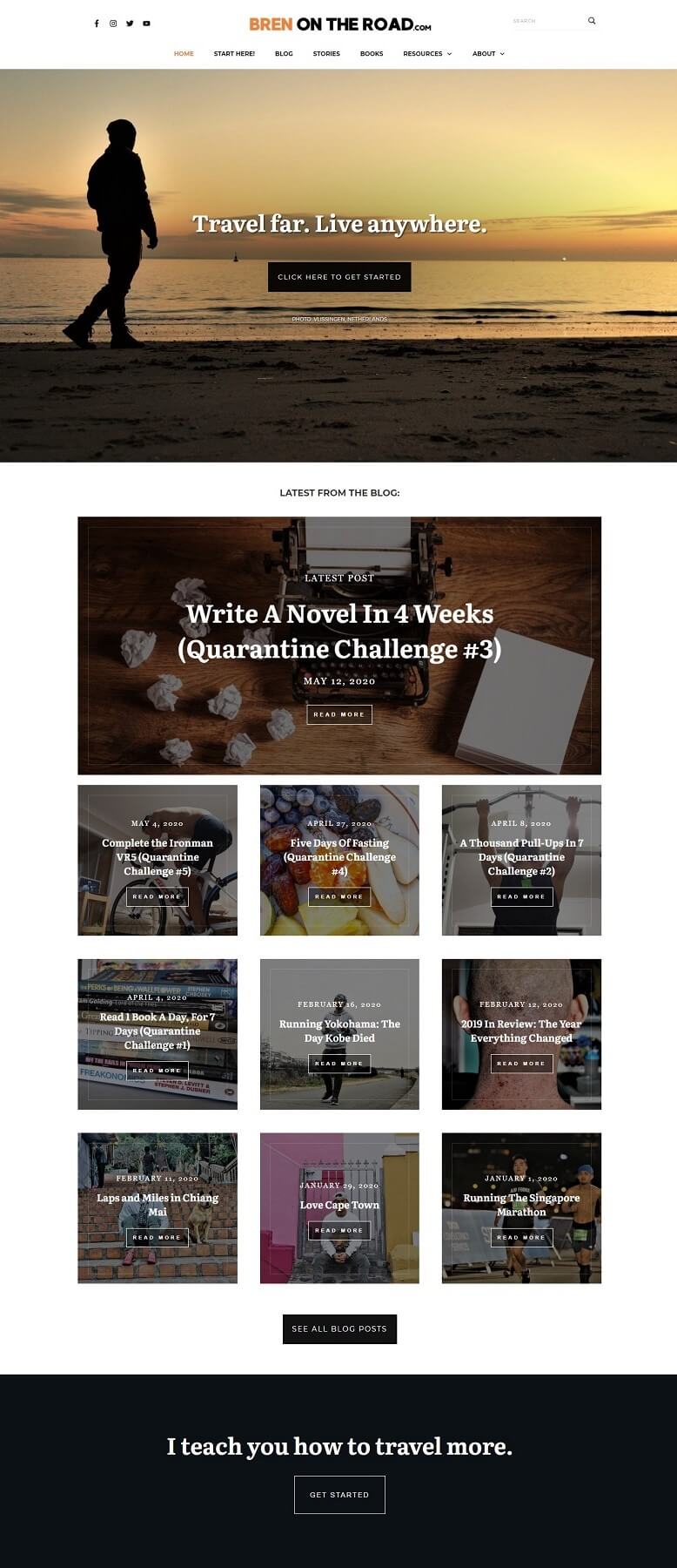
After
One of the main issues with my old home page was having too many options on the page. There were links and buttons to around nine different sections of the blog. Really you only want one (or maybe two) choices for a new visitor to have to choose from.
Also it was wordy – as you scroll down the page there’s just more and more text which isn’t very exciting for a new visitor.
Actually when I look at it now, that home page should have ended under that first row of cartoons/artworks. That would have been pretty much perfect! I wasn’t ruthless enough at the time and wanted to include everything.
Another thing is I tend to over-calibrate a lot. Since I felt like there were too many photos on the 1.0 version, I decided to have zero photos on the 2.0 version. I guess this is part of my personality where I tend to sway between extremes.
First thing you might notice is my cartoon logo has gone. That was a hard decision because I love that logo and I’m sure a lot of readers recognise the site from that logo.
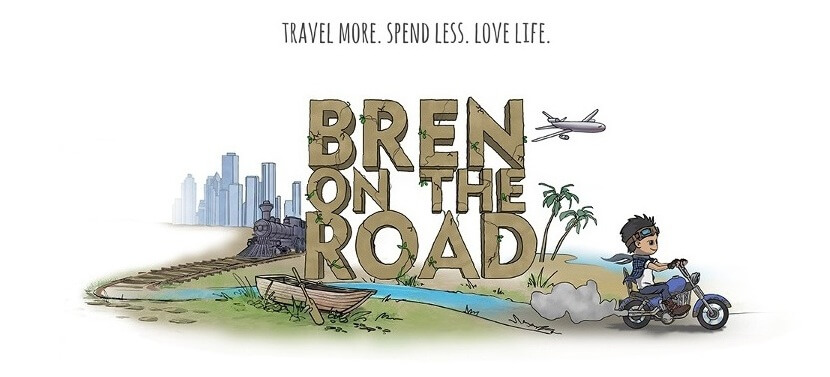
The reason it had to go was because I couldn’t redesign freely with it and I kept drifting back towards the old design. For example, I tried to keep remnants of my old “flavour” with the new logo such as:
or something like:

But that stopped me from using a clean slate and doing anything fresh, and I was kind of stuck between two worlds. I decided to ditch the old cartoon brand and build from scratch and see what I came up with.
The new logo is simpler and easier to read and maybe not quite as funky but I think it suits me and the site better especially now that I’m not 25 anymore. I still have a feeling I’ll bring this old design back when it feels retro, maybe when I’m in my fifties 😉
Simplifying the home page
There are three distinct parts of the page as you scroll down – the first part is for new readers, the second part takes you to the blog, and the footer is a subscribe box.
There’s also as little writing on the page as possible – I wanted to be more visual this time so unless you’re reading the text on a button, it should be photos dominating most of the page.
The Blog
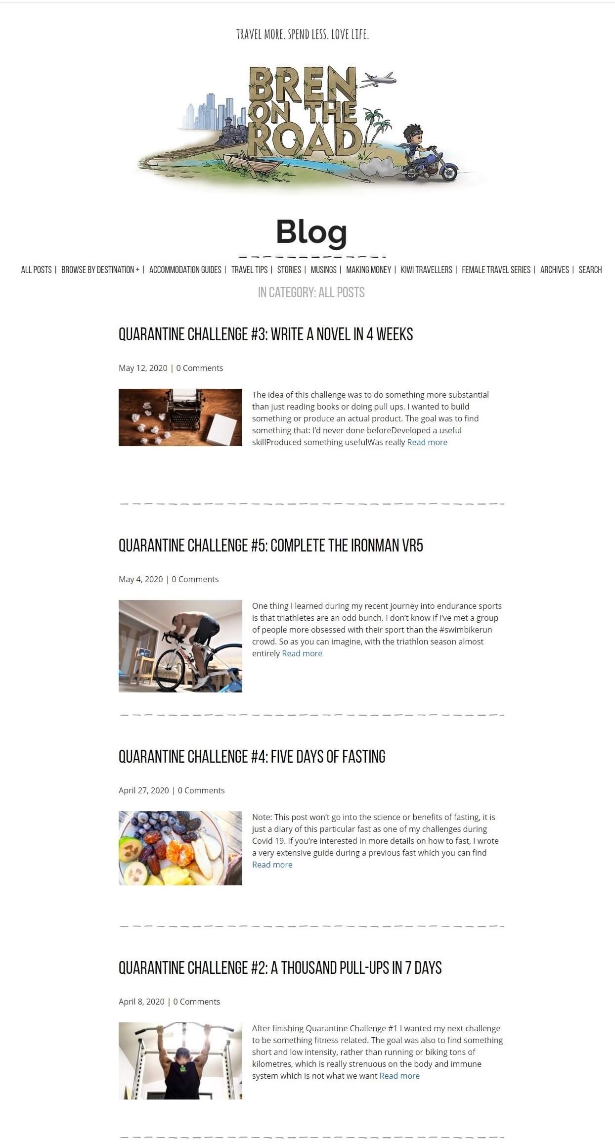
The old blog page was fine on the surface, but was patched together with different plugins and had issues with images and so on (you probably wouldn’t have noticed, but it did slow the site down).
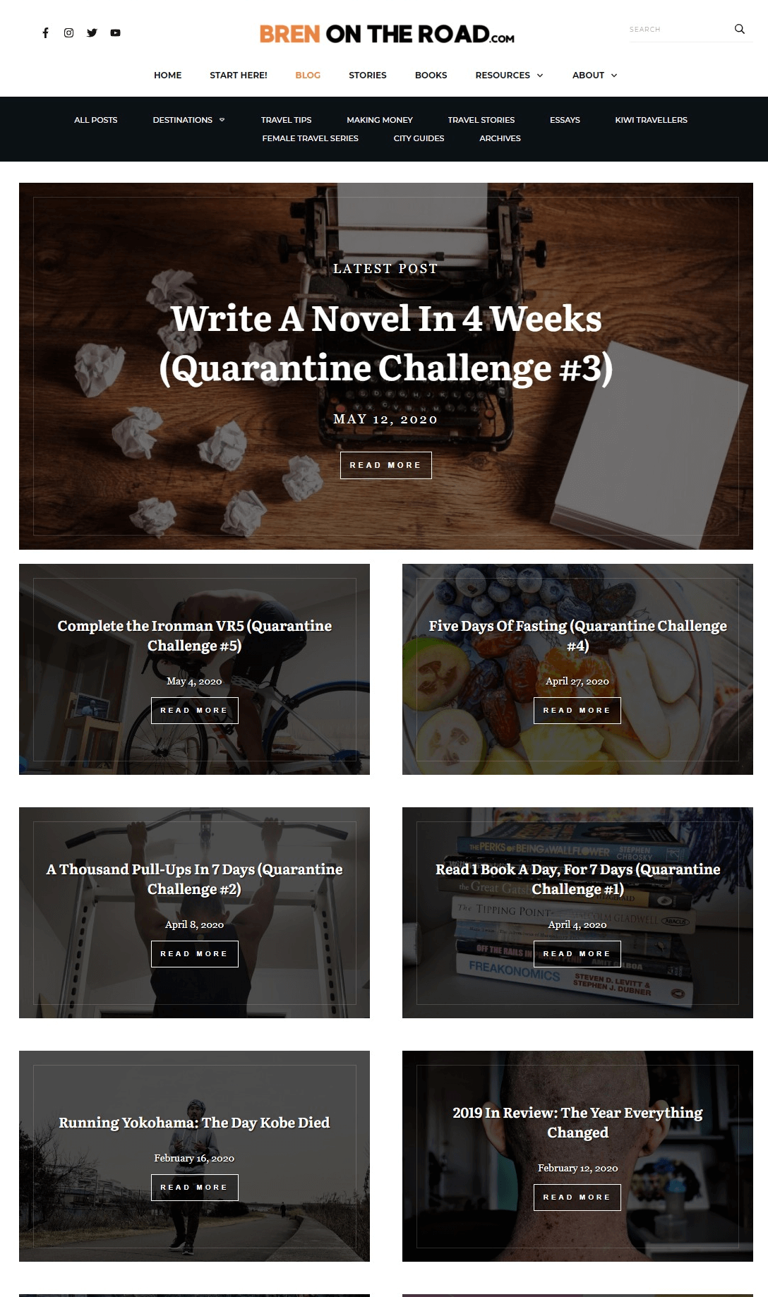
I also wanted to improve the number of posts that were displayed at one time so readers didn’t have to scroll and scroll and scroll to get anywhere. Also again, too much writing on the page.
The goal here was more photos, less writing, and faster. Now there can be around 12 posts on the screen at once, rather than the five or six you could have before. Also it just looks and moves nicer.
Before
After
Blog posts
Interestingly this is probably the most important design decision you make, because 80% of the time spent on your blog is spent reading blog posts.
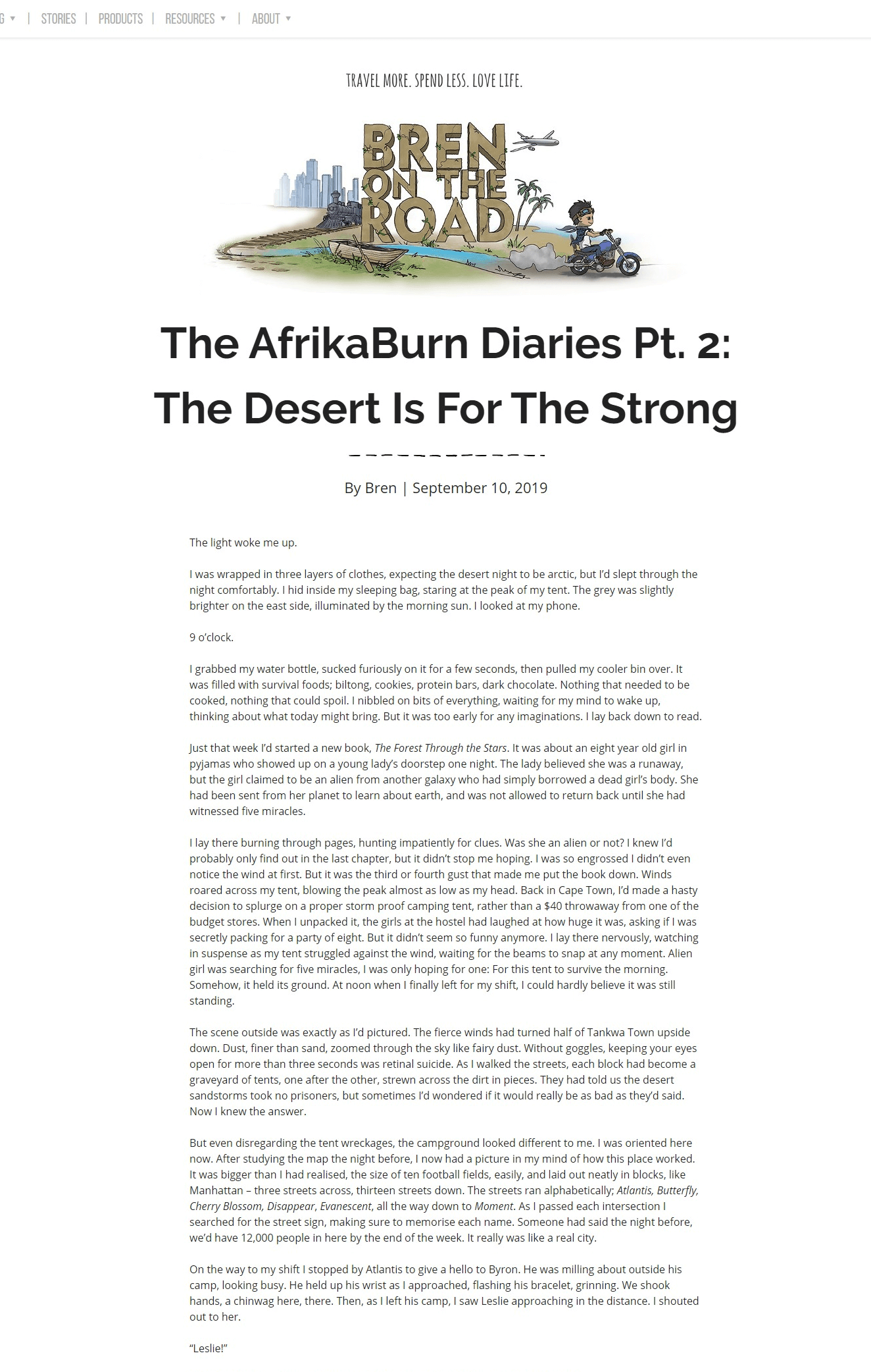
In the previous version, I wanted people to focus on the words and the stories and not bog them down with visuals. The end result was white space everywhere.
I loved the idea of white space so much I removed the sidebar completely, which is supposedly the most important area of your site (for promoting the rest of your content).
All I had on the page was the story and nothing else. I’m still glad I did that as I think it definitely made me a better writer.
Before
After
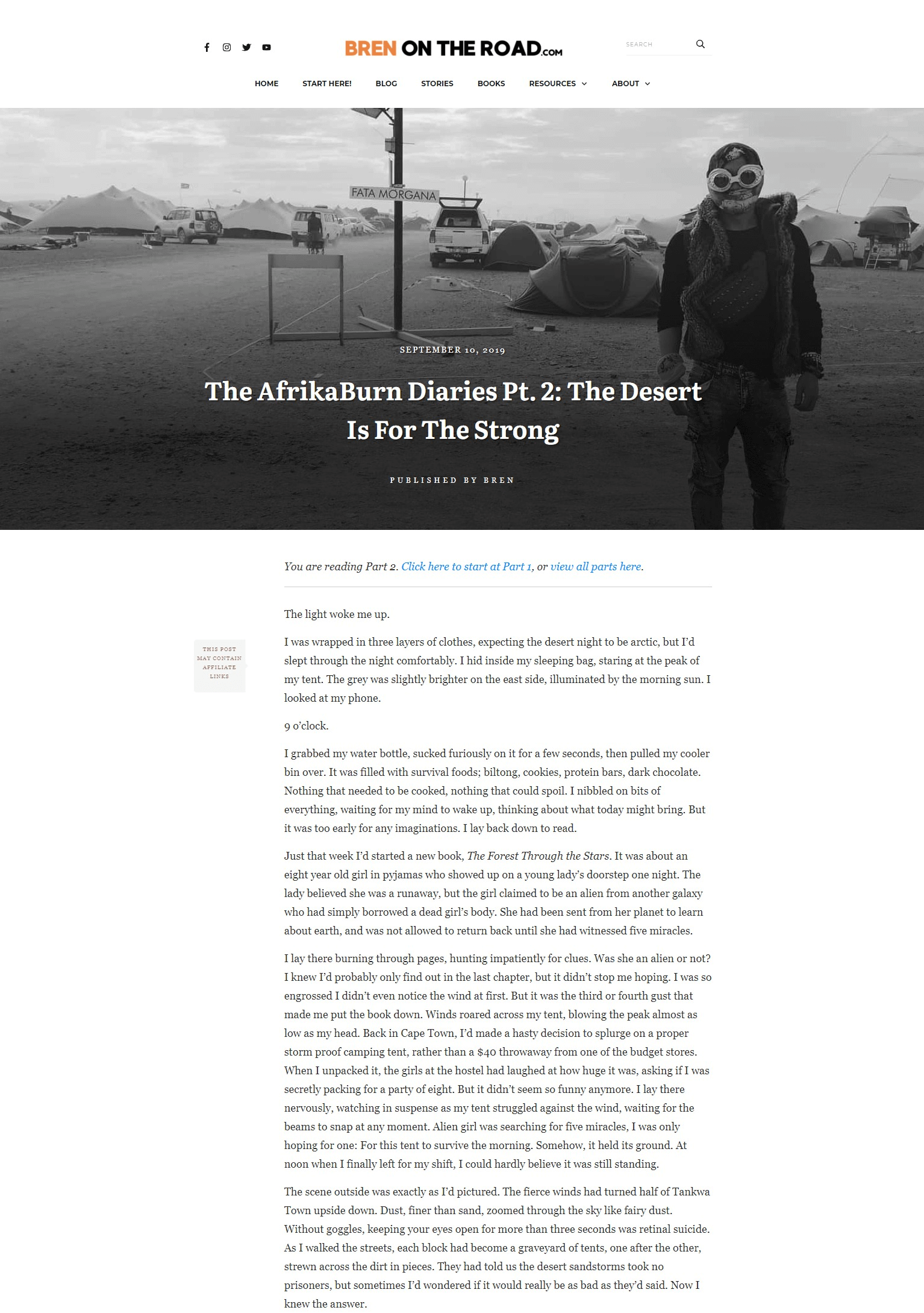
To be honest I haven’t changed much here.
The sidebar is still gone and there are only words on the page, but the featured image at the top is back. Whilst beforehand I thought photos might distract from the story, now I think the right photo adds a lot to the story and primes the reader.
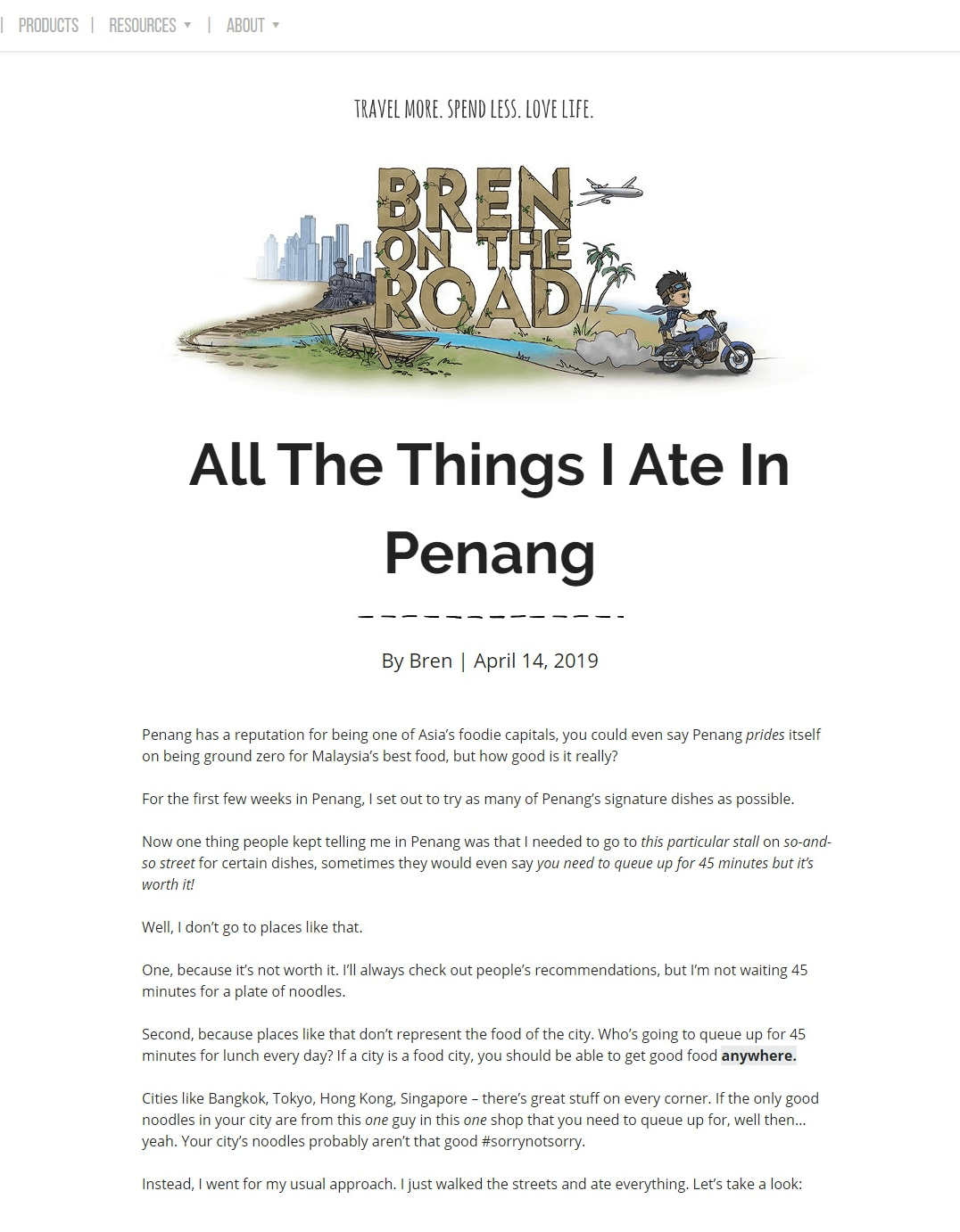
Before
After
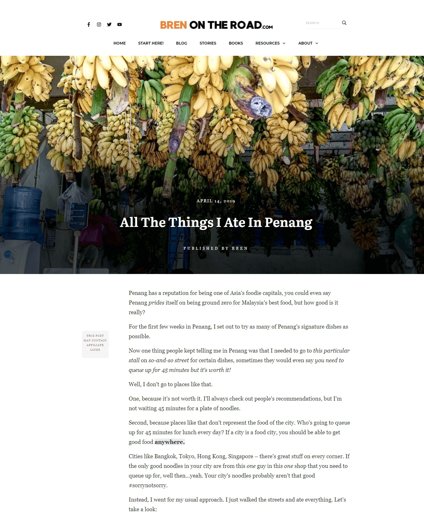
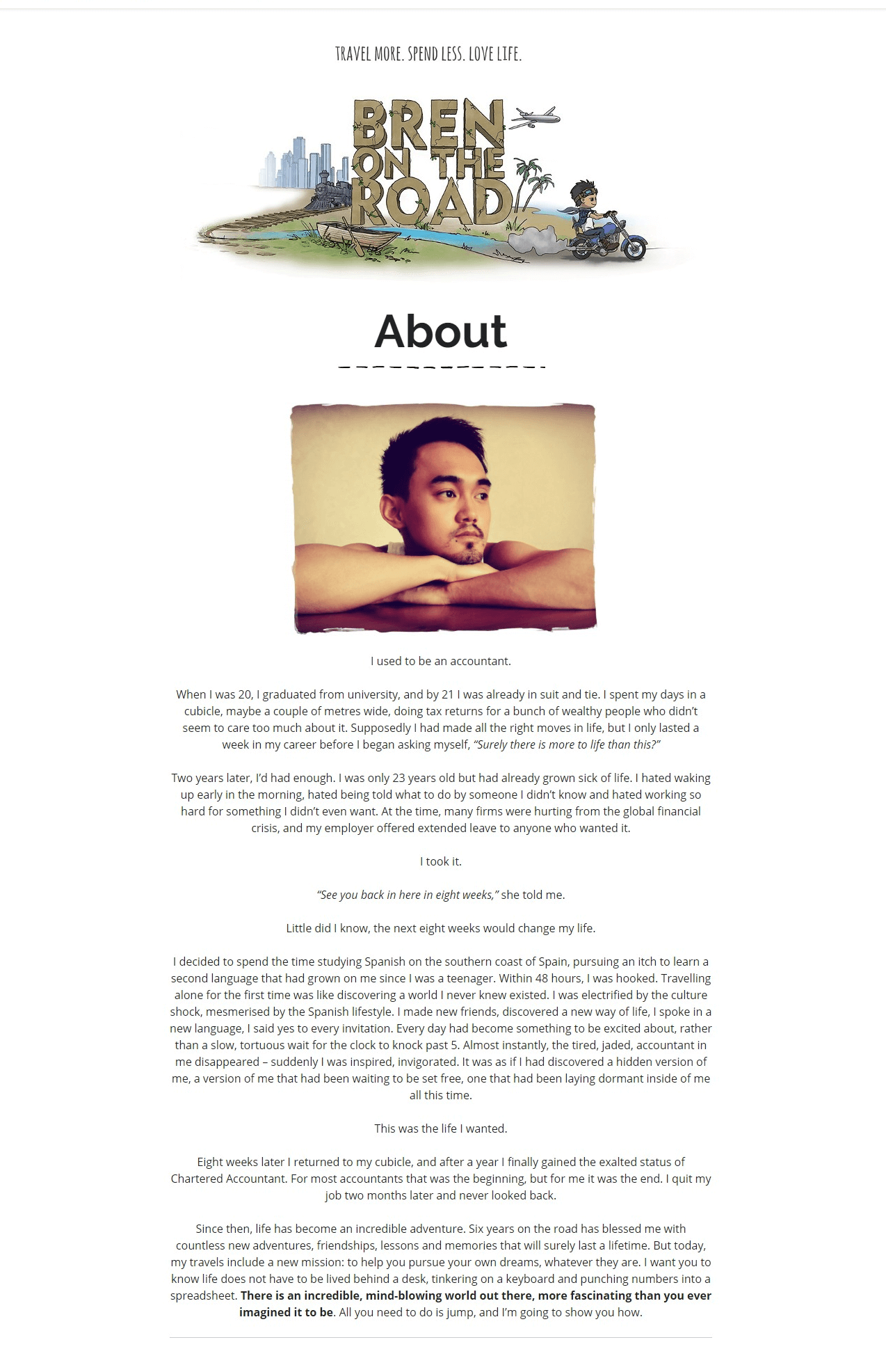
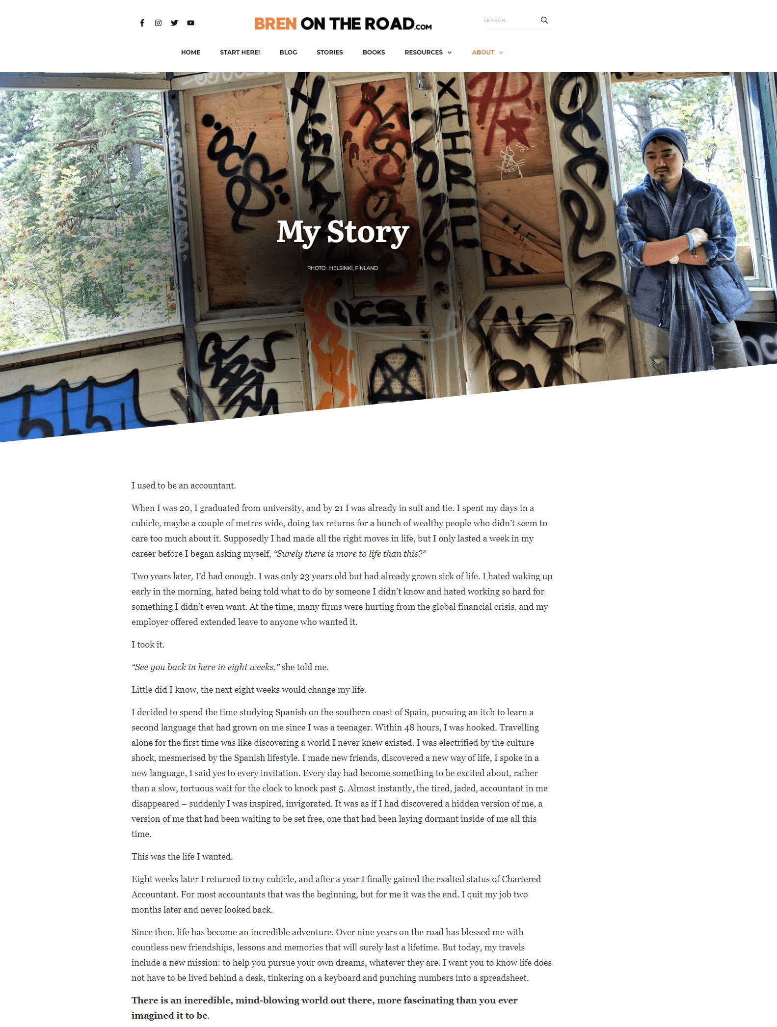
Blog pages
Blog pages are a lesser visited part of the site but still important – they include your Contact page, About page, Resources page and other standalone info readers might need.
They looked a bit bland before so I spruced them up with some travel photos. Also I realised I need to audit my site more often – I had pages with info that was way out of date which has been sitting there for years.
Before
After
What “good blogs” look like in 2020
One of the challenges with owning a blog is the internet is ever-changing. Good blog designs from five years ago no longer work and need to be revamped to keep up.
One of the main things today is mobile compatibility. Even I have noticed this change, as I rarely did any reading on my phone five years ago, and today I read almost everything on my phone while lying down.
The other thing much more relevant today is speed. Google generally removes slow sites from its search results, so site owners need to keep their sites clean and fast with good web hosts to make sure they don’t get lost in the internet.
These days most people find me via Google, and I also find I’m very unforgiving to slow sites (if a site takes longer than a few seconds to load, I usually click Back and choose a different one), so this makes it doubly important.
Therefore one of the main motivations for the redesign was not to change the way the blog looks but the way it functions.
Thankfully the new design is an improvement so far, the mobile version is great in most respects, and the site is getting much faster scores on speed tests.
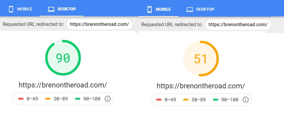
On Google Pagespeed, the old design was scoring around 45 for desktop and 10-15 for mobile! It’s much improved now:
I was also getting scores in the mid 60s and load times of around 5-6 seconds on Pingdom, which has also improved:
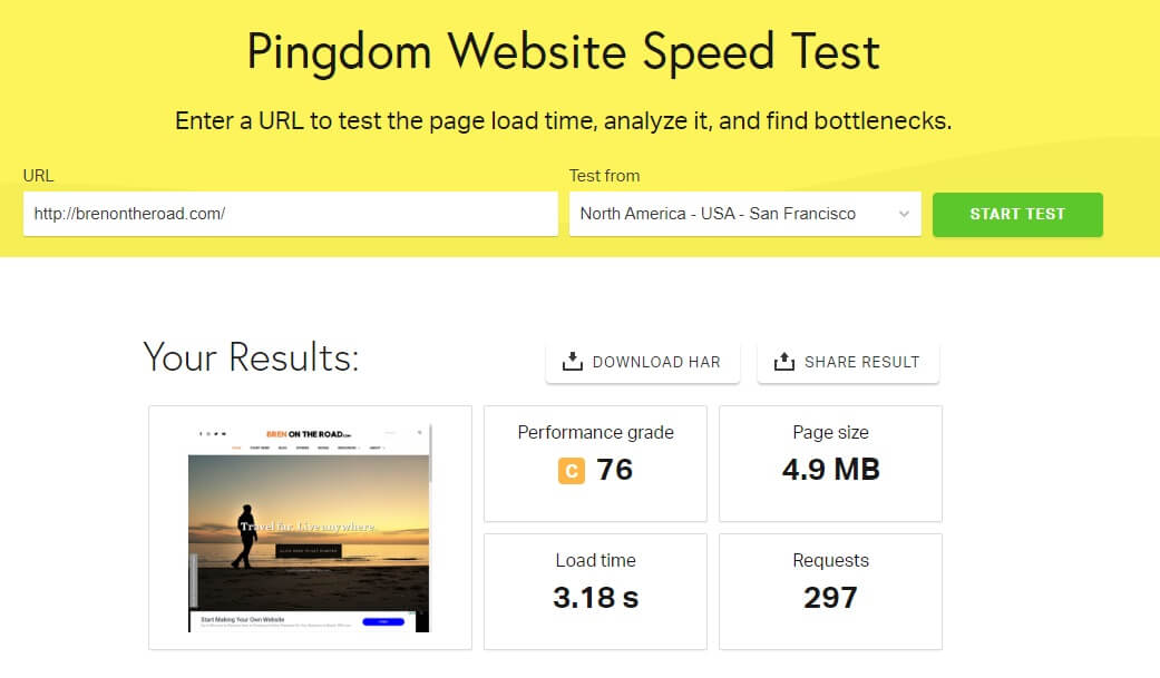
Still not nearly perfect (I mean a performance grade C? My parents would die).
So I’ll need to put aside ten or twenty hours somewhere to work on all the suggested fixes (just another behind-the-scenes blogger headache that sucks up all our time :D)
Overall though it’s moved everything in the right direction!
The Tools I used
If you’re reading this and thinking “this looks complicated” then you’ll be happy to learn this entire redesign didn’t require a single line of code, or a computer science degree, or even any experience in web design.
In fact it was even easier than using Powerpoint (which I hate), so if you’ve ever made a Powerpoint presentation in your life that didn’t look like dog shit, you can definitely make a nice-looking site just like this one.
During the redesign I used two different tools:
The first is WordPress, which is a blogging platform and is free. It’s also the most popular blogging platform, and to be honest I’ve never met a blogger who used anything else. I have a very thorough and simple guide on setting up a WordPress site here.
The second tool I used is a web design tool called Thrive Theme Builder. It’s a WordPress plugin for designing your theme, and it’s amazing!
This is a drag-and-drop tool designed for people like you and me who want to design their own blogs but don’t want to go insane while doing it. I’d actually never heard of Thrive Theme Builder until last week, but I’ve used other Thrive products on my blog in the past and they were excellent. The entire redesign shown above was done with Thrive Theme Builder and nothing else!
In the past the bootstrapper blogger strategy was to find cheap designers for $200 or $300 in China or India or Eastern Europe to design a site for you, but this is a far better option and now my recommendation to everyone. You will get full control over your design, you learn how to design beautiful sites (which technically makes you a freelance web designer and you now have a new side hustle) and the best part of all – it’s cheaper! Thrive Theme Builder – big thumbs up from me.
If you would like a look inside Thrive Theme Builder, I’ve recorded a video of me working on the redesign behind the scenes where I rebuild this entire site from scratch in around 45 minutes. You can check it out on my Youtube below:
How to get Thrive Theme Builder?
A single license for Thrive Theme Builder is $97 for lifetime use.
You can get a full demo and read everything about it by clicking here.
What’s next for Bren On The Road?
While going through and reformatting my old posts, I was reminded of what a long journey this has been. I also got to see how my blog has matured over the years and had flashbacks of the specific experiences that spurred specific articles. Never once did I expect I’d become a blogger or a writer of any sort and it’s pretty wild to see this has become my career after just falling into it randomly seven years ago.
Most of all I was reminded of all the great readers who have supported and encouraged me to keep building this site and how many great people it has brought into my life.
I just want to give a huge thank you to all of you for still being here after seven years! Who knew blogging could change so much. Hope you’ll still be here at the next redesign, and still reading these posts seven years in the future.
Stay safe everyone and be well!
B